> ## Documentation Index
> Fetch the complete documentation index at: https://docs.chainlit.io/llms.txt
> Use this file to discover all available pages before exploring further.

# Custom

The `CustomElement` class allows you to render a custom `.jsx` snippet. The `.jsx` file should be placed in `public/elements/ELEMENT_NAME.jsx`.

## Attributes

<ParamField path="name" type="str">
  The name of the custom Element. It should match the name of your JSX file (without the `.jsx` extension).
</ParamField>

<ParamField path="props" type="Dict">
  The props to pass to the JSX.
</ParamField>

<ParamField path="display" type="ElementDisplay" default="inline" optional>
  Determines how the text element should be displayed in the UI. Choices are
  "side", "inline", or "page".
</ParamField>

## How to Write the JSX file

<Note>If you are not familiar with UI development, you can pass these instructions to an LLM to ask it to generate the `.jsx` for you!</Note>

To implement the `jsx` file for your Chainlit custom element, follow these instructions.

### Component definition

Only write JSX code, no TSX. Each `.jsx` file should export default one component like:

```jsx theme={null}
export default function MyComponent() {
    return <div>Hello World</div>
}
```

The component `props` are globally injected (not as a function argument). **NEVER** pass them as function argument.

### Use Tailwind for Styling

Under the hood, the code will be rendered in a shadcn + tailwind environment.
The theme is relying on CSS variables.

Here is an example rendering a `div` with a primary color background and round border:

```jsx theme={null}
export default function TailwindExample() {
    return <div className="bg-primary rounded-md h-4 w-full" />
}
```

### Only Use Allowed Imports

Only use available packages for imports. Here is the full list:

* `react`
* `sonner`
* `zod`
* `recoil`
* `react-hook-form`
* `lucide-react`
* `@/components/ui/accordion`
* `@/components/ui/aspect-ratio`
* `@/components/ui/avatar`
* `@/components/ui/badge`
* `@/components/ui/button`
* `@/components/ui/card`
* `@/components/ui/carousel`
* `@/components/ui/checkbox`
* `@/components/ui/command`
* `@/components/ui/dialog`
* `@/components/ui/dropdown-menu`
* `@/components/ui/form`
* `@/components/ui/hover-card`
* `@/components/ui/input`
* `@/components/ui/label`
* `@/components/ui/pagination`
* `@/components/ui/popover`
* `@/components/ui/progress`
* `@/components/ui/scroll-area`
* `@/components/ui/separator`
* `@/components/ui/select`
* `@/components/ui/sheet`
* `@/components/ui/skeleton`
* `@/components/ui/switch`
* `@/components/ui/table`
* `@/components/ui/textarea`
* `@/components/ui/tooltip`

<Note>The `@/components/ui` imports are from Shadcn.</Note>

### Available APIs

Chainlit exposes the following APIs globally to make the custom element interactive.

```ts theme={null}
interface APIs {
    // Update the element props. This will re-render the element.
    updateElement: (nextProps: Record<string, any>) => Promise<{success: boolean}>;
    // Delete the element entirely.
    deleteElement: () => Promise<{success: boolean}>;
    // Call an action defined in the Chainlit app
    callAction: (action: {name: string, payload: Record<string, unknown>}) =>Promise<{success: boolean}>;
    // Send a user message
    sendUserMessage: (message: string, command?: string) => void;
}
```

### Example of a Counter Element

```jsx theme={null}
import { Button } from "@/components/ui/button"
import { X, Plus } from 'lucide-react';

export default function Counter() {
    return (
        <div id="custom-counter" className="mt-4 flex flex-col gap-2">
                <div>Count: {props.count}</div>
                <Button id="increment" onClick={() => updateElement(Object.assign(props, {count: props.count + 1}))}><Plus /> Increment</Button>
                <Button id="remove" onClick={deleteElement}><X /> Remove</Button>
        </div>
    );
}
```

## Full Example

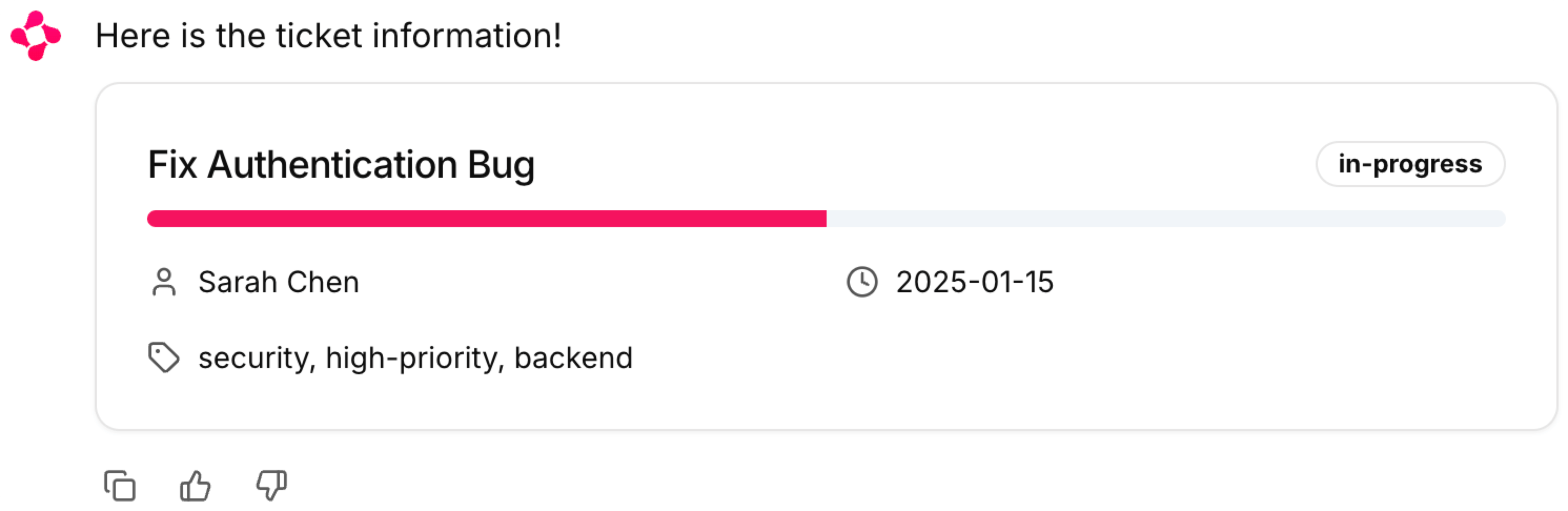
Let's build a custom element to render the status of a Linear ticket.

First, we write a small Chainlit application faking fetching data from linear:

```python app.py theme={null}
import chainlit as cl

async def get_ticket():
    """Pretending to fetch data from linear"""
    return {
        "title": "Fix Authentication Bug",
        "status": "in-progress",
        "assignee": "Sarah Chen",
        "deadline": "2025-01-15",
        "tags": ["security", "high-priority", "backend"]
    }

@cl.on_message
async def on_message(msg: cl.Message):
    # Let's pretend the user is asking about a linear ticket.
    # Usually an LLM with tool calling would be used to decide to render the component or not.
    
    props = await get_ticket()
    
    ticket_element = cl.CustomElement(name="LinearTicket", props=props)
    # Store the element if we want to update it server side at a later stage.
    cl.user_session.set("ticket_el", ticket_element)
    
    await cl.Message(content="Here is the ticket information!", elements=[ticket_element]).send()
```

Second we implement the custom element we reference in the Python code:

```jsx public/elements/LinearTicket.jsx theme={null}
import { Card, CardHeader, CardTitle, CardContent } from "@/components/ui/card"
import { Badge } from "@/components/ui/badge"
import { Progress } from "@/components/ui/progress"
import { Clock, User, Tag } from "lucide-react"

export default function TicketStatusCard() {
  const getProgressValue = (status) => {
    const progress = {
      'open': 25,
      'in-progress': 50,
      'resolved': 75,
      'closed': 100
    }
    return progress[status] || 0
  }

  return (
    <Card className="w-full max-w-md">
      <CardHeader className="pb-2">
        <div className="flex justify-between items-center">
          <CardTitle className="text-lg font-medium">
            {props.title || 'Untitled Ticket'}
          </CardTitle>
          <Badge 
            variant="outline" 
          >
            {props.status || 'Unknown'}
          </Badge>
        </div>
      </CardHeader>
      <CardContent>
        <div className="space-y-4">
          <Progress value={getProgressValue(props.status)} className="h-2" />
          
          <div className="grid grid-cols-2 gap-4 text-sm">
            <div className="flex items-center gap-2">
              <User className="h-4 w-4 opacity-70" />
              <span>{props.assignee || 'Unassigned'}</span>
            </div>
            <div className="flex items-center gap-2">
              <Clock className="h-4 w-4 opacity-70" />
              <span>{props.deadline || 'No deadline'}</span>
            </div>
            <div className="flex items-center gap-2 col-span-2">
              <Tag className="h-4 w-4 opacity-70" />
              <span>{props.tags?.join(', ') || 'No tags'}</span>
            </div>
          </div>
        </div>
      </CardContent>
    </Card>
  )
}
```

Finally, we start the application with `chainlit run app.py` and send a first message in the UI.

<Frame caption="The LinearTicket custom element rendered.">
  <img src="https://mintcdn.com/chainlit-43/b2WeFP1vh0enOZXn/images/custom-element.png?fit=max&auto=format&n=b2WeFP1vh0enOZXn&q=85&s=dc355cd25243a1726e11e174390decb1" width="2982" height="972" data-path="images/custom-element.png" />
</Frame>

## Advanced

### Update Props from Python

To update a custom element props from the python code, you can store the element instance in the user session and call `.update()` on it.

```python theme={null}
import chainlit as cl

@cl.on_chat_start
async def start():
    element = cl.CustomElement(name="Foo", props={"foo": "bar"})
    cl.user_session.set("element", element)

@cl.on_message
async def on_message():
    element = cl.user_session.get("element")
    element.props["foo"] = "baz"
    await element.update()
```

### Call a Function from Python

If you need to call a function directly from the python code, you can use `cl.CopilotFunction`.

```python call_func.py theme={null}
import chainlit as cl

@cl.on_chat_start
async def start():
    element = cl.CustomElement(name="CallFn")
    await cl.Message(content="Hello", elements=[element]).send()
    
@cl.on_message
async def on_msg(msg: cl.Message):
    fn = cl.CopilotFunction(name="test", args={"content": msg.content})
    res = await fn.acall()
```

```jsx CallFn.jsx theme={null}
import { useEffect } from 'react';
import { useRecoilValue } from 'recoil';
import { callFnState } from '@chainlit/react-client';

export default function CallFnExample() {
    const callFn = useRecoilValue(callFnState);

    useEffect(() => {
        if (callFn?.name === "test") {
          // Replace the console log with your actual function
          console.log("Function called with", callFn.args.content)
          callFn.callback()
        }
      }, [callFn]);

      return null
}
```