

CustomElement class allows you to render a custom .jsx snippet. The .jsx file should be placed in public/elements/ELEMENT_NAME.jsx.
Attributes
str
The name of the custom Element. It should match the name of your JSX file (without the
.jsx extension).Dict
The props to pass to the JSX.
ElementDisplay
default:"inline"
Determines how the text element should be displayed in the UI. Choices are
“side”, “inline”, or “page”.
How to Write the JSX file
If you are not familiar with UI development, you can pass these instructions to an LLM to ask it to generate the
.jsx for you!jsx file for your Chainlit custom element, follow these instructions.
Component definition
Only write JSX code, no TSX. Each.jsx file should export default one component like:
props are globally injected (not as a function argument). NEVER pass them as function argument.
Use Tailwind for Styling
Under the hood, the code will be rendered in a shadcn + tailwind environment. The theme is relying on CSS variables. Here is an example rendering adiv with a primary color background and round border:
Only Use Allowed Imports
Only use available packages for imports. Here is the full list:reactsonnerzodrecoilreact-hook-formlucide-react@/components/ui/accordion@/components/ui/aspect-ratio@/components/ui/avatar@/components/ui/badge@/components/ui/button@/components/ui/card@/components/ui/carousel@/components/ui/checkbox@/components/ui/command@/components/ui/dialog@/components/ui/dropdown-menu@/components/ui/form@/components/ui/hover-card@/components/ui/input@/components/ui/label@/components/ui/pagination@/components/ui/popover@/components/ui/progress@/components/ui/scroll-area@/components/ui/separator@/components/ui/select@/components/ui/sheet@/components/ui/skeleton@/components/ui/switch@/components/ui/table@/components/ui/textarea@/components/ui/tooltip
The
@/components/ui imports are from Shadcn.Available APIs
Chainlit exposes the following APIs globally to make the custom element interactive.Example of a Counter Element
Full Example
Let’s build a custom element to render the status of a Linear ticket. First, we write a small Chainlit application faking fetching data from linear:app.py
public/elements/LinearTicket.jsx
chainlit run app.py and send a first message in the UI.
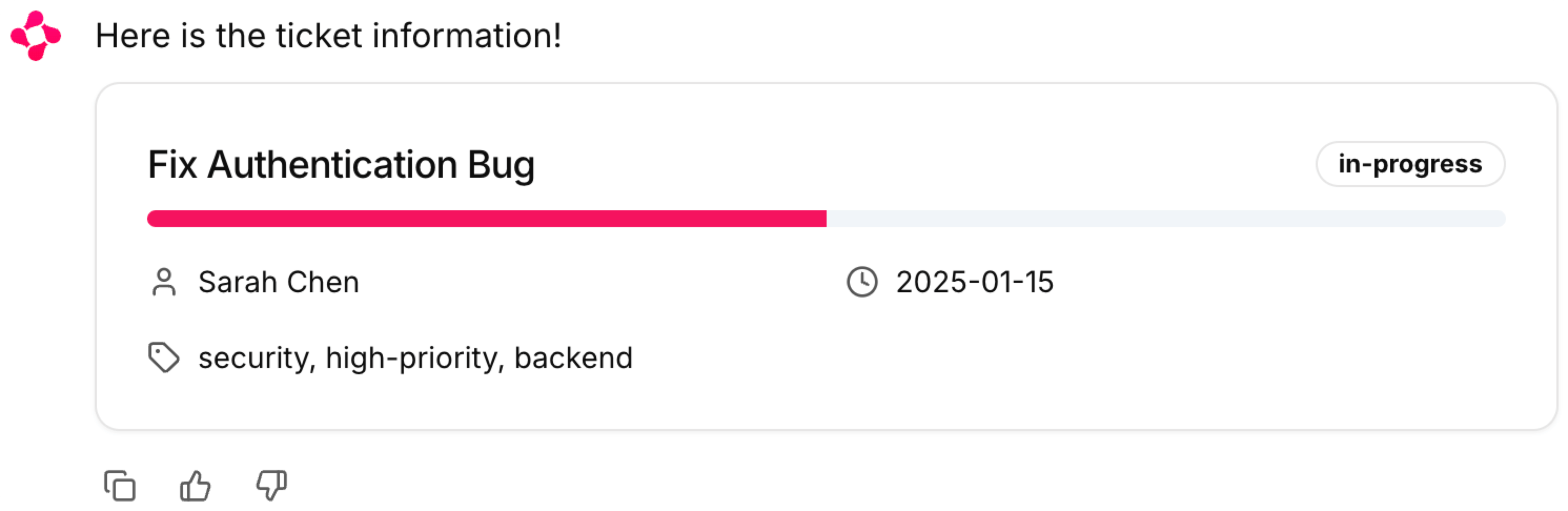
The LinearTicket custom element rendered.
Advanced
Update Props from Python
To update a custom element props from the python code, you can store the element instance in the user session and call.update() on it.
Call a Function from Python
If you need to call a function directly from the python code, you can usecl.CopilotFunction.
call_func.py
CallFn.jsx